
To get the best insight on what’s happening in your local market, always talk to your local agents. Especially in the current climate which is seeing increased off market activity.
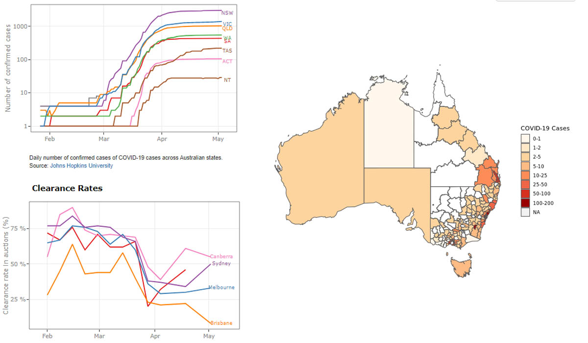
But for a neat snapshot of what is actually happening in the national and capital city property markets, check out the University of New South Wales COVID-19 Property Market Dashboard.
The clever researchers at the City Analytics Lab in the City Futures Research Centre at the UNSW Built Environment department developed the tool to track market activity, values and even Twitter sentiment. Here’s a summary of what hungry data hounds can feast upon in this metric buffet:
- total sales value
- median property prices
- auction clearance rates
- house value index
- performance of the ASX 200 real estate sector
- volume of property sales
- market sentiment
- city mobility.
Like we’ve said before, when it comes to citywide or national data – be mindful this shows broad-brush averages, and it won’t give you a clear idea of what’s happening at a specific neighbourhood, suburb or street level.
Our favourite graph shows market mood data represented by Twitter “net sentiment”. What’s that? It’s calculated using the number of positive words, minus the number of negative words of tweets relating to COVID-19 and property in Australia. Not surprisingly it can, and does, vary wildly from day to day, reflecting the rollercoaster we’re all strapped into and riding as best we can this year.
After some local insight? Contact us for a chat.